
Lesson: Neutrality in Design
Module 4: Designing & Setting Up Your Airbnb
Neutral doesn't mean bland; it means broadening your appeal. A calm, consistent base of walls, large furniture and bedding feels clean and welcoming to every guest group, photographs well and doesn't date. Personality belongs in inexpensive, easy-to-swap pieces such as cushions, throws and art, while themed or highly personal décor tends to attract a few guests and quietly push many more away.
What this lesson covers
- Why neutrality matters (psychology and business)
- What neutrality does for bookings, reviews and costs
- In the scroll
- In the review
- In your running costs
- The group test: one house, every kind of guest
- The formula: neutral base, one accent, one wow
- Walls and colours: the canvas for every photo
- Light changes your colours
- Choosing your base and accent colours, step by step
The full lesson is for clients
Clients get every step, the live walkthrough videos and our exact settings and templates from Skye’s Beach House.
Questions people ask
What colour should I paint my Airbnb?
A crisp, slightly softened white used consistently throughout is a common choice because it photographs clean and modern. Creams can photograph yellow and make a space look dated.
Should an Airbnb have a theme?
Usually not throughout. Full themes and highly personal décor narrow your audience, so a subtle sense of place through an accent colour drawn from the location works better.
How do I make a rental I can't repaint look more neutral?
Ask the landlord about a neutral repaint first, then focus on what you control: plain bedding and curtains, large rugs and art, consistent lighting and removing dated items with permission.
Watch a free lesson
 Free lesson · IntroductionWhy Naming and Identity Shape Guest BehaviourYour Airbnb hosting identity is the name that sits above all your listings, and it becomes your email address. If you might ever own more than one pro…
 Free lesson · IntroductionFree Lesson: Airbnb Arbitrage – What It Is, Why Landlords Resist It & the Margin RealityAirbnb arbitrage means leasing a property long-term at a fixed rent, running it as a short-term rental with the landlord’s written permission, and kee…
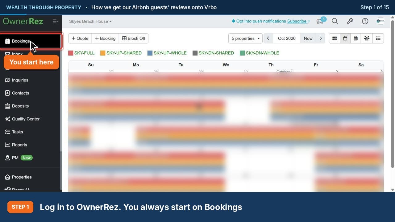 ▶Free lesson · IntroductionFree Lesson: How We Get Our Airbnb Guests’ Reviews onto Vrbo (OwnerRez)Vrbo won’t import your Airbnb reviews, but it does accept reviews that guests leave on your own OwnerRez review form. Ask every Airbnb guest to review…